
This is something that appears to have gone under the radar when it appeared, but is important to note: In March, MIT published a study on coronavirus skeptics after studying their social media habits. They found that the majority of the voices in the skeptic movement were not morons, but rather highly informed, and were using the available data to make their argument.
Of course, anyone who has spent 5 minutes looking at the counter-arguments to the virus hoax knows that skeptics are obsessed with data. However, it is very interesting that the establishment admitted this, and yet, the media continues to frame skeptics as uniformed morons who are fighting back against the government because they’ve been lied to by disinformation.
The media must maintain the illusion that there are only two choices:
- You agree with everything the media and government say, or
- You are basically retarded, believing stupid conspiracy theories that make no sense.
So, it is logical that this study was buried and ignored.
The study was about “data visualization,” i.e., infographics, and their use in informing people about the alleged virus pandemic.
Their ultimate conclusion appears to be that people will believe the official narrative more the less information they have.
MIT News, March 4, 2021:
A study from MIT shows how coronavirus skeptics have marshalled data visualizations online to argue against public health orthodoxy about the benefits of mask mandates. Such “counter-visualizations” are often quite sophisticated, using datasets from official sources and state-of-the-art visualization methods.
The researchers combed through hundreds of thousands of social media posts and found that coronavirus skeptics often deploy counter-visualizations alongside the same “follow-the-data” rhetoric as public health experts, yet the skeptics argue for radically different policies. The researchers conclude that data visualizations aren’t sufficient to convey the urgency of the Covid-19 pandemic, because even the clearest graphs can be interpreted through a variety of belief systems.
“A lot of people think of metrics like infection rates as objective,” says Crystal Lee. “But they’re clearly not, based on how much debate there is on how to think about the pandemic. That’s why we say data visualizations have become a battleground.”
…
As data visualizations rose to prominence early in the pandemic, Lee and her colleagues set out to understand how they were being deployed throughout the social media universe. “An initial hypothesis was that if we had more data visualizations, from data collected in a systematic way, then people would be better informed,” says Lee. To test that hypothesis, her team blended computational techniques with innovative ethnographic methods.
They used their computational approach on Twitter, scraping nearly half a million tweets that referred to both “Covid-19” and “data.” With those tweets, the researchers generated a network graph to find out “who’s retweeting whom and who likes whom,” says Lee. “We basically created a network of communities who are interacting with each other.” Clusters included groups like the “American media community” or “antimaskers.” The researchers found that antimask groups were creating and sharing data visualizations as much as, if not more than, other groups.
And those visualizations weren’t sloppy. “They are virtually indistinguishable from those shared by mainstream sources,” says Satyanarayan. “They are often just as polished as graphs you would expect to encounter in data journalism or public health dashboards.”
“It’s a very striking finding,” says Lee. “It shows that characterizing antimask groups as data-illiterate or not engaging with the data, is empirically false.”
…
Lee’s team followed and analyzed conversations about data visualizations in antimask Facebook groups — a practice they dubbed “deep lurking,” an online version of the ethnographic technique called “deep hanging out.” Lee says “understanding a culture requires you to observe the day-to-day informal goings-on — not just the big formal events. Deep lurking is a way to transpose these traditional ethnography approaches to digital age.”
The qualitative findings from deep lurking appeared consistent with the quantitative Twitter findings. Antimaskers on Facebook weren’t eschewing data. Rather, they discussed how different kinds of data were collected and why. “Their arguments are really quite nuanced,” says Lee. “It’s often a question of metrics.” For example, antimask groups might argue that visualizations of infection numbers could be misleading, in part because of the wide range of uncertainty in infection rates, compared to measurements like the number of deaths. In response, members of the group would often create their own counter-visualizations, even instructing each other in data visualization techniques.
“I’ve been to livestreams where people screen share and look at the data portal from the state of Georgia,” says Lee. “Then they’ll talk about how to download the data and import it into Excel.”
Jones says the antimask groups’ “idea of science is not listening passively as experts at a place like MIT tell everyone else what to believe.” He adds that this kind of behavior marks a new turn for an old cultural current. “Antimaskers’ use of data literacy reflects deep-seated American values of self-reliance and anti-expertise that date back to the founding of the country, but their online activities push those values into new arenas of public life.”
…
Combining computational and anthropological insights led the researchers to a more nuanced understanding of data literacy. Lee says their study reveals that, compared to public health orthodoxy, “antimaskers see the pandemic differently, using data that is quite similar. I still think data analysis is important. But it’s certainly not the salve that I thought it was in terms of convincing people who believe that the scientific establishment is not trustworthy.” Lee says their findings point to “a larger rift in how we think about science and expertise in the U.S.” That same rift runs through issues like climate change and vaccination, where similar dynamics often play out in social media discussions.
To make these results accessible to the public, Lee and her collaborator, CSAIL PhD student Jonathan Zong, led a team of seven MIT undergraduate researchers to develop an interactive narrative where readers can explore the visualizations and conversations for themselves.
Lee describes the team’s research as a first step in making sense of the role of data and visualizations in these broader debates. “Data visualization is not objective. It’s not absolute. It is in fact an incredibly social and political endeavor. We have to be attentive to how people interpret them outside of the scientific establishment.”
So, they’re not outright saying “give the peasants even less information,” but that appears to be the obvious conclusion here.
Indeed, we’ve been seeing this trend over the last several weeks, and more intensely in the last week. The Biden Administration is now just aggressively calling for a total shutdown on any information that runs counter to the vaxx narrative.
If you’ve listened to what Biden and his people have been saying for the last week, you know this is not an exaggeration: they are saying “shut down anyone who has any questions about the vaccines, and silence them across all platforms.”
Seriously, who the fuck is the White House to be dictating who should and should not be banned from social media platforms, to keep lists of who they think are the spreaders of "misinformation," and then pressure companies they regulate to obey? This is pernicious shit: https://t.co/WlZlbCjlqT
— Glenn Greenwald (@ggreenwald) July 16, 2021
Peter Doocy just destroyed the White House's calls for censorship of "disinformation" on live TV.
Psaki did not see this one coming.
Watch the entire video. pic.twitter.com/ITPrMfdPFW
— Benny Johnson (@bennyjohnson) July 16, 2021
White House Reporter: "On Covid misinformation, what's your message to platforms like Facebook?"
President Biden: "They're killing people. The only pandemic we have is among the unvaccinated-and they're killing people."
Thank you, @POTUS. pic.twitter.com/nxfi05uxjZ
— Amee Vanderpool (@girlsreallyrule) July 17, 2021
CNN's Dana Bash: Do you think Fox News is killing people with its anti-vax rhetoric?
Surgeon General Vivek Murthy: "My worry is that all of this is misinformation that’s floating around, it’s having a real cost that can be measured in lives lost and that is just tragic." pic.twitter.com/0NFurVIB4s
— Justin Baragona (@justinbaragona) July 18, 2021
Obviously if the data could stand alone and lead people to the same conclusions about the threat of the supposed virus versus the competing threat of the vaccine, there would be no need for censorship. The current claim is that the people who disagree with the government are like babies who need to have their thoughts controlled by the government, but the reality is that most people who are standing against the deadly vaxx are well informed on the data.
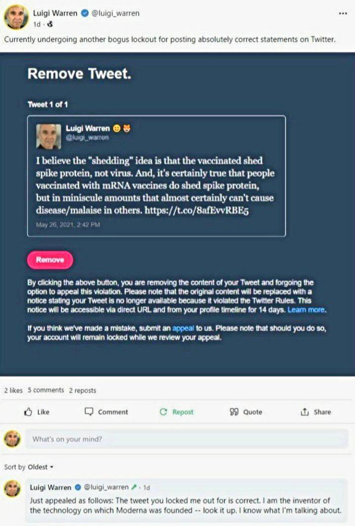
Here’s a funny censorship example, which proves everything we’re saying here.
Here at Hoax Watch, we do nothing but post data, nonstop. The government’s own data proves our points, if you go in and consider their data-gathering methods, which is one of the “nuances” MIT is talking about above.
For example, we know that anyone who has a positive test – or is suspected of having the virus – is recorded as a coronavirus death, regardless of the cause of death. Conversely, we know that the only way the deaths from the vaxx are being tracked is through the ridiculous self-reporting system of the VAERS database.
With the data having failed them, the government is now relying purely on stupid lies. They’re now telling us that deaths are rising at the same time that the vaxx is being deployed, and claiming falsely that the only people who are “spreading the virus” are the unvaxxed. This is at the same time that state authorities are reporting mass death among the vaxxed, supposedly from this alleged virus. They are claiming that the vaxx works, but that the unvaxxed are spreading it to the vaxxed somehow. This makes no sense on its face, and is not backed up by any data.
The newest Israeli data indicate ~complete vaccine failure on every level. Remember: Israel used only the @pfizer mRNA shot and followed Pfizer dosing schedule. This data, from the @IsraelMOH telegram account, show nearly all serious cases and deaths are now among the vaccinated. pic.twitter.com/ITqCE3bUrx
— Alex Berenson (@AlexBerenson) July 18, 2021
#Israel bans entry to #vaccinated tourists in attempt to control spiking #COVID19 numbers.
Report by @RossTercatin https://t.co/hwNHiu0Lp1
— The Jerusalem Post (@Jerusalem_Post) July 19, 2021
What the data is actually showing is total vaccine failure, with most of the deaths globally attributed to the virus now coming from the vaxxed.
The truth is more powerful than lies, and that is why this entire system is falling back on censorship, 100%, to defend its lies.
Censorship is the surest sign of a losing argument. And if the government persists in this nonsense, we will end up in a very dark place.
— Alex Berenson (@AlexBerenson) July 17, 2021
Don’t let these people tell you you’re a moron. You’re not a moron. If you were a moron, you would believe everything the government says, despite the fact that they have constantly been caught lying to you, over and over and over again.
This is going to get weirder before it gets less weird.
Don’t let them gaslight you. You know what is right and what is true.
And you know that there is no level of submission that these people will accept – other than total surrender of your body and soul to the agenda.
You need to strengthen yourself, strengthen your faith in God, and continue daily to remind yourself that under no circumstances will you submit to the vaxx.


